Creating Book Covers
An interview with David Löwe
Writing, 4 January 2019
It is said that you shouldn’t judge a book by its cover, but that is exactly what we do every time we choose something to read.
Whether we are browsing in our favourite bookshop for something to curl up with by the fire, trawling the shelves at the airport for something to devour on the beach, or flicking through the seemingly endless possibilities on the online stores, the first thing that will catch our eye and encourage us to look further is the cover.
So important is this aspect of publishing a book that a great deal of ink, virtual or otherwise, has been spilled on the pros and cons of different approaches to cover design. So much so that, for an author preparing his book for publication, it can all seem, at the very least, confusing and, in reality, extremely daunting.
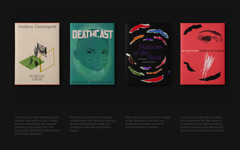
For the covers of my collections No Way Home, featuring the stand-alone novellas Screen Grab, Deathcast and Stations of the Soul, and Dear Lucifer and Other Stories, I had the great fortune of working with someone who is not only a great friend but also a great designer, David Löwe, from Berlin, Germany.
I had always admired his creative eye, and when he suggested that he would be interested in designing the covers of the two collections, I leapt at the chance.
I was not to be disappointed, as the resulting images are both evocative and highly individual. I only hope that the content of the books matches up to them.
Whether we are browsing in our favourite bookshop for something to curl up with by the fire, trawling the shelves at the airport for something to devour on the beach, or flicking through the seemingly endless possibilities on the online stores, the first thing that will catch our eye and encourage us to look further is the cover.
So important is this aspect of publishing a book that a great deal of ink, virtual or otherwise, has been spilled on the pros and cons of different approaches to cover design. So much so that, for an author preparing his book for publication, it can all seem, at the very least, confusing and, in reality, extremely daunting.
For the covers of my collections No Way Home, featuring the stand-alone novellas Screen Grab, Deathcast and Stations of the Soul, and Dear Lucifer and Other Stories, I had the great fortune of working with someone who is not only a great friend but also a great designer, David Löwe, from Berlin, Germany.
I had always admired his creative eye, and when he suggested that he would be interested in designing the covers of the two collections, I leapt at the chance.
I was not to be disappointed, as the resulting images are both evocative and highly individual. I only hope that the content of the books matches up to them.
To find out how David approaches design in general, and the covers for No Way Home and Dear Lucifer and Other Stories in particular, I caught up with him recently, asking him first of all how he comes up with his ideas.
What should the reader feel?
“When creating a cover I usually start by asking the author about the content, the main theme or any references points, such as places, certain objects, etc, that I could build my ideas on. However, I do not read the whole book.”
“No matter if it’s for a print book or an eBook, the key visual should give potential readers a glimpse into what they can expect. It should ideally represent the mood of the content. So, I ask the author: What do you want your audience to feel when they look at your book? Needless to say, any cover should say: ‘Pick me up’, or ‘Look at me’.”
“No matter if it’s for a print book or an eBook, the key visual should give potential readers a glimpse into what they can expect. It should ideally represent the mood of the content. So, I ask the author: What do you want your audience to feel when they look at your book? Needless to say, any cover should say: ‘Pick me up’, or ‘Look at me’.”
Unexpected accidents
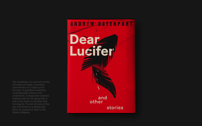
“With Dear Lucifer and Other Stories, I didn’t shy away from using the first idea that came to mind. I knew there should be a feather on the cover. The question was: What should the feather look like, and how should I create it? Do I want to draw it, paint it, stitch it? I decided in the end to simply cut it out of paper and see if that would work.”
“Having cut lots of feathers out of paper, I scanned them. As well as scanning them on top of the paper they were cut from, I laid them on the scanner again and again, folded the paper, ripped it apart, all to see what would happen.”
“This helped to force some unexpected accidents and give me more options to choose from. This created surprising results that I might not have thought of.”
“In short, experimenting with a rather handmade approach keeps the results lively and interesting, in my opinion. It can be hard sometimes to let go in this way, but I do trust the process.”
“When combining the final imagery with the typography, I try to let the image and type intertwine, if possible, to create a good composition.”
00:00
/
00:00
“Nothing is more boring than just throwing type on an image.”
“The final cover is either created in Photoshop or InDesign. Although I ‘have to’ use computer programs and effects sometimes, I try not to rely on them. I don’t want my work to be seen as computer graphics but as visual compositions made with the help of technology, if that makes sense. It therefore helps to start with a handmade approach in the beginning.”
Rip it up and start again
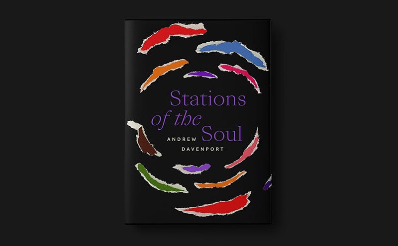
“With Stations of the Soul, the process was very similar. From the initial conversation, I knew that 24 hours in the city of London set the stage for an energetic trip for a group of people. So my starting points were night, energy and group, to put it very simply.”
“So again I ripped up some coloured paper that could represent the flickering lights of a city or the visual effect you would see through a lit church window, in reference to the title. The paper pieces had to be ripped because ripping is, at its core, an impulsive, energetic and unpredictable process.”
“So again I ripped up some coloured paper that could represent the flickering lights of a city or the visual effect you would see through a lit church window, in reference to the title. The paper pieces had to be ripped because ripping is, at its core, an impulsive, energetic and unpredictable process.”
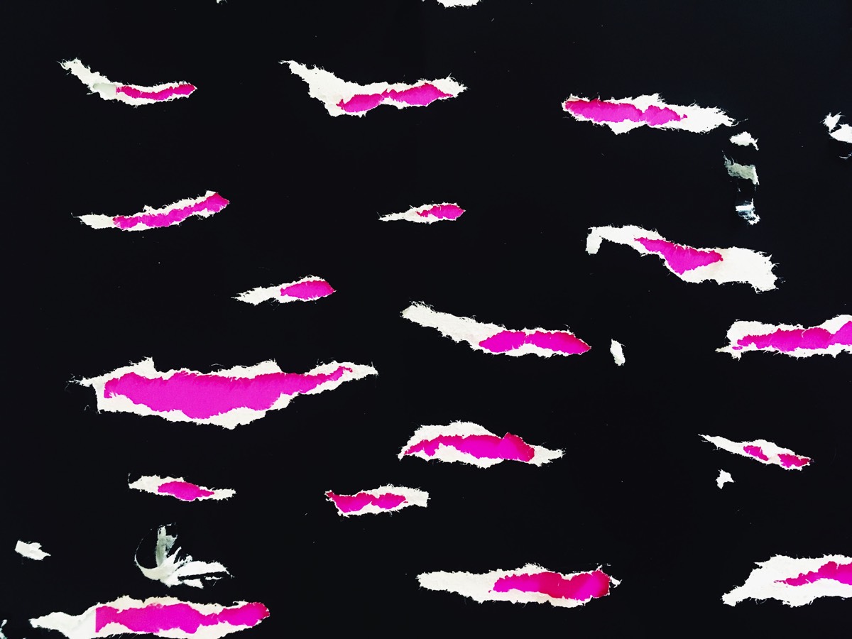


“Actually, I didn’t think it was working because all the ripped paper elements were too straight. So I tried again and again, until I decided I would bend them digitally. I feel like a magician giving my secrets away but it was the only thing that worked in the end!”
“The final composition, with its typography, feels strangely busy and calm at the same time. I am rarely happy with my own work but I am with this one.”
“The final composition, with its typography, feels strangely busy and calm at the same time. I am rarely happy with my own work but I am with this one.”
Sticking to type
“The choice of typefaces can become very subjective, to be honest, but it always adds to the overall theme, idea or mood that I want to achieve.”

“It is sometimes a challenge to persuade clients to spend money on typefaces. They usually say: ‘Just pick a free font’, but the results tend to be generic and mediocre.”
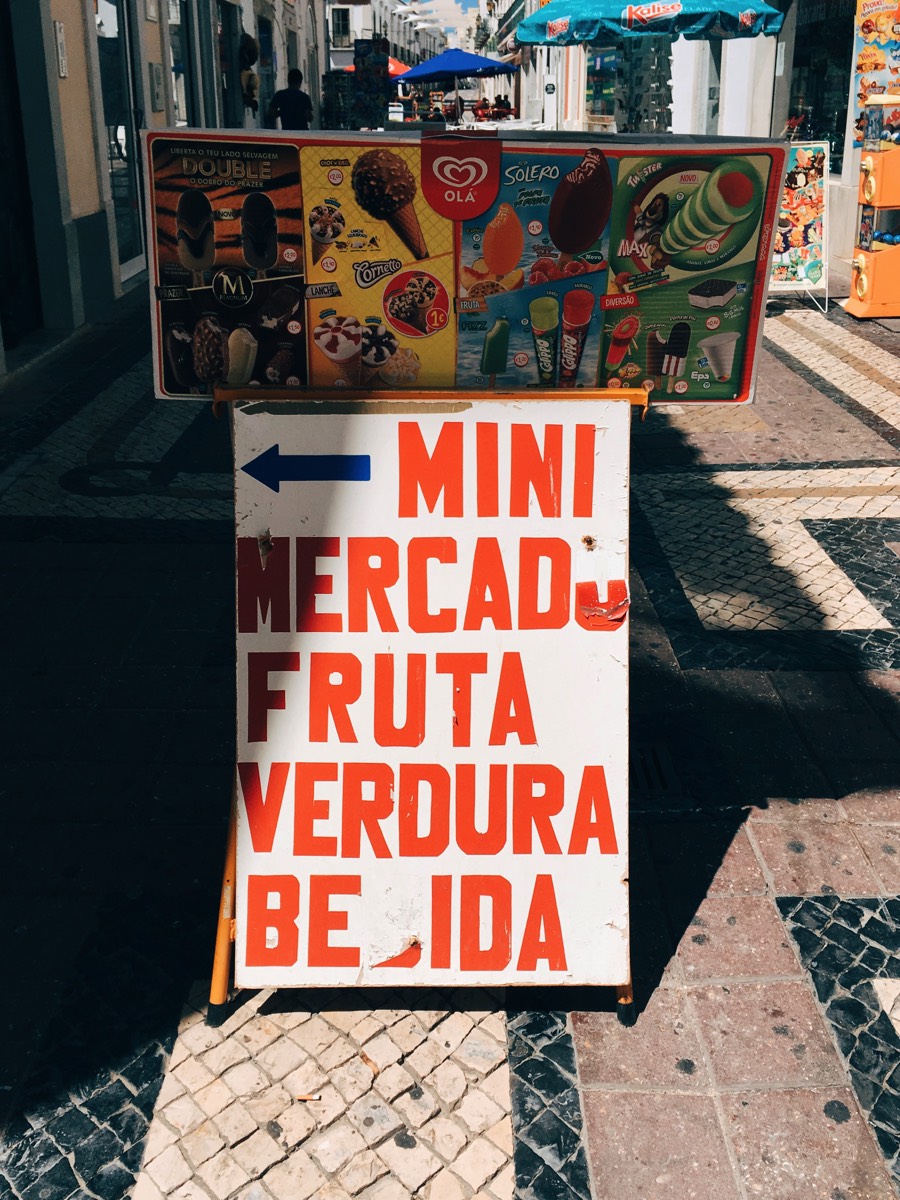
“One challenge in this regard was the typography of Deathcast. It is made from a street sign I photographed in Faro that said MINI MERCADO FRUTA VERDURA, so I had to add the missing letters without losing the initial look.”
“One challenge in this regard was the typography of Deathcast. It is made from a street sign I photographed in Faro that said MINI MERCADO FRUTA VERDURA, so I had to add the missing letters without losing the initial look.”
The eBook challenge
“There are some different challenges for eBooks, I think. While a paper book in a bookstore is usually a few centimeters away from you, an eBook cover needs to work in a thumbnail size format. That means that type size plays an important role, especially if you just scroll or swipe though tiny images in an eBook store.”
“Then again, I might be wrong and people just choose a book because they’ve read a review, or usually pick a certain type of genre or author. With regards to the covers I created, one could argue that the typography is pretty small on some of them.”
“Then again, I might be wrong and people just choose a book because they’ve read a review, or usually pick a certain type of genre or author. With regards to the covers I created, one could argue that the typography is pretty small on some of them.”
Getting animated
“Video and animated content is standard these days so I always try to bring some kind of animation into the final pieces. Depending on the actual cover, it can be bold or fairly subtle.”
“Take No Way Home, for example, where I combined elements from all other covers. The title itself kind-of suggested the way this should be animated – simply going back and forth, with no end and no home.”
“Another project I did recently was a concert poster for Romanian pianist Ana Silvestru, celebrating the music of Claude Debussy, in which you could hold your phone in front of the poster and watch it become animated.”
“I basically cut some old NASA footage and added Claude Debussy’s Claire du Lune, and the experience is a little magical.”
00:00
/
00:00
And now?
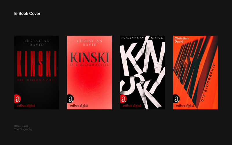
“I am looking forward to 2019 getting underway. I am doing a lot of eBook titles for the German publisher Aufbau Verlag at the moment, and hopefully I’ll get the chance to do a few print books too. There is nothing like the smell of printed paper, and it is nicer to display on a bookshelf than in an eBook store. No offence...!”
You can see more of David’s work and some of what inspires him on Instagram.
You can see more of David’s work and some of what inspires him on Instagram.
© L.A. Davenport 2017-2024.
0 ratings
Cookies are used to improve your experience on this site and to better understand the audience. Find out more here.
Out Now!
Creating Book Covers | Pushing the Wave